Five sneaky website mistakes that are quietly sabotaging your vibe—and how to fix them fast.
Website Mistakes I See All the Time (And How to Fix Them)

Featured On The Blog
Five sneaky website mistakes that are quietly sabotaging your vibe—and how to fix them fast.
Website Mistakes I See All the Time (And How to Fix Them)


I’ve seen a lot of websites—some stunning, some… not so much. And honestly? The same handful of website mistakes show up again and again, even on sites that look nice at first glance.
Here’s the thing: your site can be beautiful and still be confusing, slow, or missing the mark. So let’s break down 5 common mistakes and what to do instead to avoid common mistakes on websites.
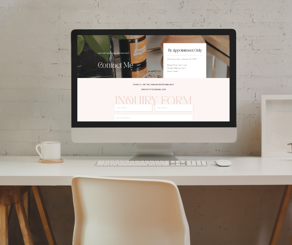
1. No Clear Call to Action
If people don’t know what to do next, they’ll do… nothing. One of the biggest website mistakes is skipping a clear call to action. Whether you want people to book, buy, or join your list, that CTA needs to be obvious—and repeated.
🛠 Fix it: Add a button or link that stands out, and make sure it shows up in multiple places.
2. Your Homepage is Doing Too Much
You don’t need to cram everything into one scroll. If your homepage feels cluttered, visitors might bounce before they even figure out what you do. This kind of website mistake is especially common among new businesses.
🛠 Fix it: Keep it simple. Focus on your core message and link out to the details.
3. Poor Mobile Experience
It’s 2025. People are looking at your site on their phone. If it’s hard to read, slow to load, or the buttons are tiny—it’s game over. Neglecting mobile optimization might be one of the worst website mistakes you can make.
🛠 Fix it: Make sure your design is responsive. (Pro tip: Showit gives you mobile editing power!)
4. It’s Not Aligned with Your Brand
Your colors, fonts, and tone should all match the vibe of your business. Mismatched visuals can create confusion or make things feel a little…off and reflect poorly, marking one of many common website mistakes.
🛠 Fix it: Get clear on your brand identity. Need help? Grab my Website Glow-Up Checklist to get started.
5. No Real Personality
You don’t have to be quirky or loud—but your site should sound like you. A super formal or generic tone won’t help people connect.
🛠 Fix it: Write like you talk. Infuse your personality. Let people get to know you a little to avoid one of the frequent website mistakes.
Your website doesn’t have to be perfect, but avoiding these website mistakes can make a big difference. Start small, make intentional changes, and build a site that supports your business without the stress.
Need help? I offer custom web design, template customization, and resources to help you create a site that’s both beautiful and strategic. Avoid these common website mistakes with professional help.
Website Mistakes I See All the Time (And How to Fix Them)
Website Mistakes I See All the Time (And How to Fix Them)
Website Mistakes I See All the Time (And How to Fix Them)
Top Reads